Thursday, November 02, 2006

Registered Architect


8 1/2 Years of College...
$75,000 dollars.
3 Years NCARB intern program fees...
$450 dollars.
9 Registration Exams and study guides...
$2,150 dollars.
Finally being able to call yourself an Architect...
Priceless.


12 years after starting as an apprentice draftsman, I can now call myself an Architect. The path to becoming an architect involved 8 years of being an apprentice draftsman and project manager, 2 college degrees, 3 years being an 'intern architect' and sending credit reports to the NCARB national council, and 9 exams on topics ranging from design to structural engineering. "Architect" is a title protected by state government by a 'title law,' meaning its illegal to present yourself as an Architect without going through the hoops and obtaining a state license. The State licenses architects in order to "protect the health, safety, and welfare of the public" as the phrase goes. It's similar in concept to the legal requirements for being an M.D. in order to prevent quack doctors from killing people.

It's a huge relief to have jumped through that final hoop and finished the goal I've been working towards all these years. Perhaps it's time for a vacation, or better yet some nice big commercial projects to help pay off those student loans.

Dixon Architecture


As some of you have heard, I've starting working with Ken Dixon and his crew over at Dixon Architecture. I'm currently working on 2 monstrous precast concrete manufacturing facilities, some bank work, and a few other miscellaneous projects. I'm really digging my teeth into the large scale commercial work again after having spent the past year doing residential.

Posted here is my design for one of the manufacturing facilities. The client hadn't been satisfied with any of the sketches he had seen to date. So when I came on board I boiled down the numerous different looks and concepts that had been developed for the project so far. I kept some of the concepts, further developed some, and tossed some other out completely. The result was this sleek modernist design. Night and dawn views of a building like this do wonders to show off what might otherwise seem like a fairly boring concrete box, if seen only as a basic line drawing or in a sketchy form. Some projects show off much better with a 'warm fuzzy' sketch, but in this case the crisp photo-rendering definitely came through to really communicate the clarity of the design.


.

Sunday, October 01, 2006

Ncarb Testing Completed


I've received my 'Pass' letter for the last of the 9 test administered by the National Council of Architectural Registration Boards required to become a licensed architect. Just a few paperwork hoops left to jump though and I'll be able to call myself an 'Architect.' The title Architect is protected by a title law, and calling oneself an architect without holding an architects license is similar to posing as a medical doctor. Architects are licensed by the states in order to 'protect the health, safety, and welfare of the public.' Obviously it's not in the best interest of the public to have any yokel designing public buildings. Perhaps I'll post more later on the path to becoming an architect, for those who might be curious about such a cryptic subject.

Tuesday, September 19, 2006

Lakefront Living in Wisconsin


My latest project was to take a floor plan designed by a fine home builder in Wisconsin and develop the floor plan into a full-fledged design. Off to the left I have posted the original wall layout I was given. The house sets on a lakefront walkout site. I always love lakefront houses because they require the rear elevation of the house be just as important and appealing as the front. This avoids the ‘3 sides vinyl’ syndrome so many new houses have; where all the attention, detail, and budget is sunk into a fancy front elevation and the other 3 sides are neglected flat vinyl planes.


I’ve been on somewhat of a Craftsman kick lately for residential projects. Either I’m developing a style, or I’m just stuck in a stylistic rut, depending on your point of view. Either way, these Craftsman designs seem to be working very well. They have enough detail and style to be charming, and yet can still be reasonably straightforward so as not to blow the project budget.

The color renderings are shots of the final design I developed. When given the chance, I prefer to design homes with a bit more of a contemporary flair to them, such as the Laverty Cottage, Merkebee House, or Orsini Residence. But even these more modern designs still have some Arts and Crafts overtones.


Click the comments link below to add your public comment.

Thursday, August 10, 2006

Quoted:

"A porch is the transition space between the street, which is public, and the living room, which is private," Maxam said. "It provides the space to greet someone coming to your home.”

According to the National Association of Homebuilders, 42 percent of new single family homes had porches 14 years ago. Today, that number rises to 53 percent.

From an article on porches by Beth Lively at the Rapid Growth webzine.

Thursday, July 27, 2006

"Boxy, but Good" : Maxam Design Vs. Stock Plans

New Project: 3 Bedroom Ranch for a site on Pine Island drive, north of Grand Rapids.

Parameters: Approx. 1400 s.f., Large bedrooms, One story, Affordable to build, Construction price of $180,000 or less.

I was presented with the challenge of designing this house, in lieu of the developer using a set of 'stock plans' available from a lumberyard. Competing with stock plans is often difficult from a desginer's point of view. There is a certain convenience and simplicity to flipping through a catalog until you see a design that looks about right and buying a set of plans. It is Architecture packaged as a retail shopping experience. However Architecture, like Medicine, will always be a professional service. Sure, there are over the counter medicines available for retail purchase that are somewhat helpful for many common situations, but if you really want to be healthy, see a doctor.

The trouble with stock plans is that there are many that look about right; but close analysis reveals the problems of not designing a house for its situation. A stock house often won't fit right on the site, puts the bedrooms next to the busy street, has the driveway too close to the intersection; and that’s just the site analysis. Sometimes the closets and bedrooms are a bit too small for a good furniture layout, or there are no windows to take advantage of a nice side yard view. Perhaps the steep 'McMansion' roof line looks OK, but costs far too much to build. Maybe the plans great, but that giant brick arch entry is just too pretentious and out of scale for the otherwise humble home. What I'd really like to know is when having more than 1 window in a room went out of style. Having light and views from 2 directions in a room makes all the difference in how a space feels. So many stock plans make no use of the corner rooms in a house at all. No amount of superficial arches or pointless 45 degree angles to 'jazz up' a design will make up for the loss of windows on both exterior walls of corner rooms.

"Boxy, but Good" is a phrase that often comes to mind when I want to describe a design that is simple and straightforward yet still well thought out. Often times 'boxy' designs are the boring ones that no one put much thought into, or leave you thinking that saving every possible penny at any cost was the motivating factor. My design seeks to take the typical 3 bedroom ranch and make it something more than a vinyl sided storage bin for the average American family. The simplicity of the shape keeps it affordable and easy to build. The layout of the rooms creates a very livable flow and tucks the bedrooms furthest away from the streets of the corner lot. Bedrooms are separated by closets or bathrooms to give some acoustical privacy. The living areas are well defined, yet open to one another to create a light and spacious environment without needlessly wasting space. The curb appeal comes from the logical overall proportions and the porch which wraps around to present a facade to each street of the corner. It’s a real functional porch, large enough to enjoy a glass of lemonade or even a whole meal, and right off the kitchen and dining.

"Boxy but Good?" Comments?

Thursday, June 15, 2006

Baldwin Cabin : Modernism Undone


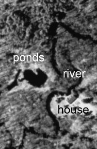
My latest commission is to design the complete remodel of a house on the Baldwin River for realtor and developer EJ Parry. Its an odd thing to take a house that was originally modernist and retro-convert it back to a traditional design. Typically updating results in things looking more modern, but the sands of the hourglass flow upwards in this case.The location of this house is great, with property on both sides of the river. The site even has some ponds that were dug into it. The 2 ponds are in the shape of the Upper and Lower Peninsula of Michigan. It’s particularly noticeable in the satellite image of the property.


The house itself is in horrible shape. It’s a 40's vintage vacation home, originally flat roofed with a brick facade and floor to ceiling plate glass windows. In its day is must have been quite a hip mod party pad. Great river views; a great fieldstone outdoor grill; and patio built into the hill. It has massive limestone fireplaces on the main level and the walkout basement level. It even has a stone indoor charcoal grill built next to the basement stone fireplace.

By the 1970's the place was probably quite rundown, and someone must have bought it as a hunting cabin and decided to "modernize it." They put a pitched roof over the original flat roof, filled in all the large plate glass window openings with T1-11 plywood siding, and in their place installed traditional double hung windows, only sideways. They are actual double hung windows, with all the normal locking and lifting hardware, but installed sideways so that they function like slider windows. I would have to guess they did this to try to make the view wider, but it looks completely absurd.

Once again 30 years has passed and the place is ready to updated by new owners again. This time it needs to be brought up to full-time home standards good enough to be the dream home for a couple to retire in. Currently it has 3 bedrooms and 2 baths upstairs, but the plan is quite poor. The kitchen and dining are on the 'road side' of the house rather than the 'river side' so there really isn't any kitchen or dining views. Meanwhile the bedrooms, which are usually empty, have the good corner views. The beautiful river views are about the only asset the house has, but the existing floor plan doesn't take advantage of the views whatsoever. The plan is 'compartmentalized' by walls which limit the views and make it feel smaller than it is. The bathrooms need complete updating, and are hopelessly cramped by today's standards.

I've worked out the plan and done a few versions of the exterior. Working with the owner we've landed on a mix of log and cedar shake to walk the line between "cabin" and "Craftsman" styles to give it a 'northern Michigan vacation home' feel with some 'timeless quality'.


(Feel free to leave comments by clicking comments below)